Object / ImageDisplay
This class is used to create images, which may be colors, patterns, gradients, pictures or even callback hooks. Because backgrounds and images are managed seamlessly by the Area and Image classes, you don't have to bother about this class, unless you want to handle backgrounds and images yourself.
Spec -- (01.00) [IS.], STRPTR
This attribute defines the image type and attributes. The specification string is similar to the background CSS property, it has only been slightly extended to support patterns, gradients and callback hooks.
The image managed by the object can be modified at any time. You don't need to dispose the object and create another to be able to use a different image. Still, don't forget to setup the object with the Setup method.
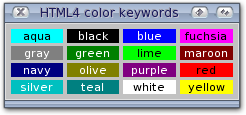
HTML4 color keywords
The list of HTML4 keyword color names is: aqua (#00FFFF), black (#000000), blue (#0000FF), fuchsia (#FF00FF), gray (#808080), green (#008000), lime (#00FF00), maroon (#800000), navy (#000080), olive (#808000), purple (#800080), red (#FF0000), silver (#C0C0C0), teal (#008080), white (#FFFFFF), and yellow (#FFFF00). The color names are case-insensitive.
<?xml version="1.0" ?>

<feelin:application>
    <Application Id="app">
        <Window Id="win" Title="HTML4 color keywords" Open="true">
            <Group Rows="4" SameSize="true">
                <Text Style="background: aqua; color: black" Contents="aqua" HCenter="true" />
                <Text Style="background: black; color: white" Contents="black" HCenter="true" />
                <Text Style="background: blue; color: white" Contents="blue" HCenter="true" />
                <Text Style="background: fuchsia; color: black" Contents="fuchsia" HCenter="true" />
                <Text Style="background: gray; color: white" Contents="gray" HCenter="true" />
                <Text Style="background: green; color: white" Contents="green" HCenter="true" />
                <Text Style="background: lime; color: black" Contents="lime" HCenter="true" />
                <Text Style="background: maroon; color: white" Contents="maroon" HCenter="true" />
                <Text Style="background: navy; color: white" Contents="navy" HCenter="true" />
                <Text Style="background: olive; color: white" Contents="olive" HCenter="true" />
                <Text Style="background: purple; color: white" Contents="purple" HCenter="true" />
                <Text Style="background: red; color: black" Contents="red" HCenter="true" />
                <Text Style="background: silver; color: white" Contents="silver" HCenter="true" />
                <Text Style="background: teal; color: white" Contents="teal" HCenter="true" />
                <Text Style="background: white; color: black" Contents="white" HCenter="true" />
                <Text Style="background: yellow; color: black" Contents="yellow" HCenter="true" />
            </Group>
        </Window>
    </Application>

    <notify>
        <win attribute="CloseRequest" value="true" target="app" method="Shutdown" />
    </notify>
</feelin:application>
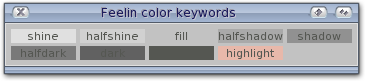
Feelin color keywords
The list of Feelin keyword color names is: shine, halfshine, fill, halfshadow, shadow, halfdark, dark, text and highlight. The color names are case-insensitive. These keywords have no fixed values, instead they are taken from the palette passed within the Render object. The palette is usualy created by the Area class during its Setup method from the palette property.
<?xml version="1.0" ?>

<feelin:application>
    <Application Id="app">
        <Window Id="win" Title="Feelin color keywords" Open="true">
            <Group Rows="2" SameSize="true">
                <Text HCenter="true" Contents="shine" Style="background: shine" />
                <Text HCenter="true" Contents="halfshine" Style="background: halfshine" />
                <Text HCenter="true" Contents="fill" Style="background: fill" />
                <Text HCenter="true" Contents="halfshadow" Style="background: halfshadow" />
                <Text HCenter="true" Contents="shadow" Style="background: shadow" />
                <Text HCenter="true" Contents="halfdark" Style="background: halfdark" />
                <Text HCenter="true" Contents="dark" Style="background: dark" />
                <Text HCenter="true" Contents="text" Style="background: text" />
                <Text HCenter="true" Contents="highlight" Style="background: highlight" />
                <Widget />
            </Group>
        </Window>
    </Application>

    <notify>
        <win attribute="CloseRequest" value="true" target="app" method="Shutdown" />
    </notify>
</feelin:application>
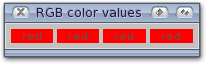
RGB color values
The format of an RGB value in hexadecimal notation is a '#' immediately followed by either three or six hexadecimal characters. The three-digit RGB notation (#rgb) is converted into six-digit form (#rrggbb) by replicating digits, not by adding zeros. For example, #fb0 expands to #ffbb00. This ensures that white (#ffffff) can be specified with the short notation (#fff) and removes any dependencies on the color depth of the display.
The format of an RGB value in the functional notation is 'rgb(' followed by a comma-separated list of three numerical values (either three integer values or three percentage values) followed by ')'. The integer value 255 corresponds to 100%, and to F or FF in the hexadecimal notation: rgb(255,255,255) = rgb(100%,100%,100%) = #FFF. White space characters are allowed around the numerical values.
<?xml version="1.0" ?>

<feelin:application>
    <Application Id="app">
        <Window Id="win" Title="RGB color values" Open="true">
            <Group SameSize="true">
                <Text Contents="red" HCenter="true" Style="background: #F00"/>
                <Text Contents="red" HCenter="true" Style="background: #FF0000" />
                <Text Contents="red" HCenter="true" Style="background: rgb(255,0,0)" />
                <Text Contents="red" HCenter="true" Style="background: rgb(100%, 0, 0)" />
            </Group>
        </Window>
    </Application>

    <notify>
        <win attribute="CloseRequest" value="true" target="app" method="Shutdown" />
    </notify>
</feelin:application>
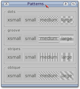
Patterns
A pattern is created when two colors are defined along with one of the following style keywords: dots, groove, stripes and oblique, and optionnaly one of the following size keywords: xsmall, small, medium and large.
/* pattern.css */

pattern-info
{
    text-position: center;
    font-size: 2em;
    padding: 5px;
}
<?xml version="1.0" ?>

<?xml-stylesheet href="patterns.css" type="text/css" ?>

<feelin:application>
    <Application Id="app">
        <Window Id="win" Title="Patterns" Open="true">
            <Group Orientation="vertical">

                <Group class="box" Caption="dots">
                    <Text class="pattern-info" Contents="xsmall" style="background: halfshine halfshadow dots xsmall" />
                    <Text class="pattern-info" Contents="small" style="background: halfshine halfshadow dots small" />
                    <Text class="pattern-info" Contents="medium" style="background: halfshine halfshadow dots medium" />
                    <Text class="pattern-info" Contents="large" style="background: halfshine halfshadow dots large" />
                </Group>

                <Group class="box" Caption="groove">
                    <Text class="pattern-info" Contents="xsmall" style="background: halfshine halfshadow groove xsmall" />
                    <Text class="pattern-info" Contents="small" style="background: halfshine halfshadow groove small" />
                    <Text class="pattern-info" Contents="medium" style="background: halfshine halfshadow groove medium" />
                    <Text class="pattern-info" Contents="large" style="background: halfshine halfshadow groove large" />
                </Group>

                <Group class="box" Caption="stripes">
                    <Text class="pattern-info" Contents="xsmall" style="background: halfshine halfshadow stripes xsmall" />
                    <Text class="pattern-info" Contents="small" style="background: halfshine halfshadow stripes small" />
                    <Text class="pattern-info" Contents="medium" style="background: halfshine halfshadow stripes medium" />
                    <Text class="pattern-info" Contents="large" style="background: halfshine halfshadow stripes large" />
                </Group>

                <Group class="box" Caption="oblique">
                    <Text class="pattern-info" Contents="xsmall" style="background: halfshine halfshadow oblique xsmall" />
                    <Text class="pattern-info" Contents="small" style="background: halfshine halfshadow oblique small" />
                    <Text class="pattern-info" Contents="medium" style="background: halfshine halfshadow oblique medium" />
                    <Text class="pattern-info" Contents="large" style="background: halfshine halfshadow oblique large" />
                </Group>

            </Group>
        </Window>
    </Application>

    <notify>
        <win attribute="CloseRequest" value="true" target="app" method="Shutdown" />
    </notify>
</feelin:application>
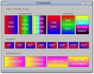
Gradients
A gradient is created when two, three or four colors are defined, its angle can optionnaly be defined, but only vertical (90°, 270°) and horizontal (0°, 180°) degrees can be used for three or four colors gradients.
If the Owner of the object is defined, the gradient is re-oriented to match the owner's orientation by substracting 90 degrees from the angle. This re-orientation can be modified by defining the clockwise keyword, in which case 90 degrees are added to the angle.
/* gradients.css */

gradient-box
{
    color: white;
    text-position: center;
    preparse: <align=center>;
    font-size: 1.5em;
    padding: 5px;
    border: 1px solid dark;
}
<?xml version="1.0" ?>
<?xml-stylesheet href="patterns.css" type="text/css" ?>
<feelin:application> <Application Id="app"> <Window Id="win" Title="Gradients" Open="true"> <Group Orientation="vertical">
<Group class="box" Caption="Two, Three, Four"> <Group SameSize="true" Caption="horizontal" style="border-top: 2px groove shadow; caption-position: up center;"> <Text class="gradient-box" Contents="red<br>blue" style="background: red blue" /> <Text class="gradient-box" Contents="red<br>lime<br>blue" style="background: red lime blue" /> <Text class="gradient-box" Contents="yellow<br>aqua<br>fuchsia<br>black" style="background: yellow aqua fuchsia black" /> </Group>
<Group SameSize="true" Caption="vertical" style="border-top: 2px groove shadow; caption-position: up center;"> <Text class="gradient-box" Contents="red<br>blue" style="background: 90° red blue" /> <Text class="gradient-box" Contents="red<br>lime<br>blue" style="background: 90° red lime blue" /> <Text class="gradient-box" Contents="yellow<br>aqua<br>fuchsia<br>black" style="background: 90° yellow aqua fuchsia black" /> </Group> </Group>
<Group class="box" SameSize="true" Caption="Angles"> <Text class="gradient-box" Contents="0°" style="background: red blue 0°" /> <Text class="gradient-box" Contents="45°" style="background: red blue 45°" /> <Text class="gradient-box" Contents="90°" style="background: red blue 90°" /> <Text class="gradient-box" Contents="135°" style="background: red blue 135°" /> <Text class="gradient-box" Contents="180°" style="background: red blue 180°" /> <Text class="gradient-box" Contents="225°" style="background: red blue 225°" /> <Text class="gradient-box" Contents="270°" style="background: red blue 270°" /> <Text class="gradient-box" Contents="315°" style="background: red blue 315°" /> </Group>
<Group class="box" SameSize="true" Caption="Orientation"> <Text class="gradient-box" Orientation="horizontal" Contents="horizontal" style="background: yellow fuchsia 0°" /> <Text class="gradient-box" Orientation="horizontal" Contents="horizontal<br>clockwise" style="background: yellow fuchsia 0° clockwise" /> <Text class="gradient-box" Orientation="vertical" Contents="vertical" style="background: yellow fuchsia 0°" /> <Text class="gradient-box" Orientation="vertical" Contents="vertical<br>clockwise" style="background: yellow fuchsia 0° clockwise" /> </Group> </Group> </Window> </Application>
<notify> <win attribute="CloseRequest" value="true" target="app" method="Shutdown" /> </notify> </feelin:application>
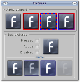
Picture
A picture is defined using the functional notation 'url(' followed by the path to the picture file followed by ')'. The path is currently only relative to the application's working directory. Thus, is is recommanded to use absolute pathes.
If you define the multiple keyword, the picture is horizontaly splet in four subpictures, one for each of the following states: normal, touch, focus and ghost. The state is selected during the Draw method according to the flags defined.
Optionnaly you can define a color to fill the background of the picture or its surrendings if the picture is not to be repeated, or only partialy.
<?xml version="1.0" ?>

<feelin:application>
    <Application Id="app">
        <Window Id="win" Title="Pictures" Open="true">
            <Group Orientation="vertical">

                <Group class="box" Caption="Alpha support">
                    <Image Spec="url(button.png)" />
                    <Image Spec="url(button.png)" style="background: red" />
                    <Image Spec="url(button.png)" style="background: red blue oblique large" />
                    <Image Spec="url(button.png)" style="background: red blue 315°" />
                </Group>

                <Group class="box" Caption="Sub pictures" Orientation="vertical">
                    <Group>
                        <Group Columns="2">
                            <HLabel Align="end">Pressed</HLabel>
                            <Checkbox Id="check-pressed" />
                            <HLabel Align="end">Active</HLabel>
                            <Checkbox Id="check-active" />
                            <HLabel Align="end">Disabled</HLabel>
                            <Checkbox Id="check-disabled" />
                        </Group>

                        <Bar />

                        <Image Id="button" Mode="release" Spec="url(button-multiple.png) multiple" />
                    </Group>

                    <Bar Title="source" />

                    <Image Spec="url(button-multiple.png)" />
                </Group>
            </Group>
        </Window>
    </Application>

    <notify>
        <win attribute="CloseRequest" value="true" target="app" method="Shutdown" />
        <check-pressed attribute="Selected" value="always" target="button" method="Set" message="Pressed,value" />
        <check-active attribute="Selected" value="always" target="button" method="Set" message="Active,value" />
        <check-disabled attribute="Selected" value="always" target="button" method="Set" message="Disabled,value" />
    </notify>
</feelin:application>
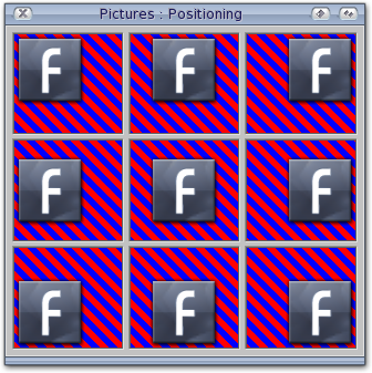
The initial position of the picture is defined using the following keywords: top, bottom, left, right, center, or a percentage value:
top left, left top; Same as '0% 0%'.
top, top center, center top; Same as '50% 0%'.
righttop, top right; Same as '100% 0%'.
left, left center, center left; Same as '0% 50%'.
center, center center; Same as '50% 50%'.
right, right center, center right; Same as '100% 50%'.
bottom left, left bottom; Same as '0% 100%'.
bottom, bottom center, center bottom; Same as '50% 100%'.
bottom right, right bottom; Same as '100% 100%'.
/* pictures-positioning.css */

picture-box
{
    background: red blue oblique large;
    border-frame: win-in;
}
<?xml version="1.0" ?>

<?xml-stylesheet href="pictures-positioning.css" type="text/css" ?>

<feelin:application>
    <Application Id="app">
        <Window Id="win" Title="Pictures : Positioning" Open="true">
            <Group Orientation="vertical">
                <Group>
                    <Image class="picture-box" SetMax="none" Spec="url(button.png) no-repeat top left" />
                    <Image class="picture-box" SetMax="none" Spec="url(button.png) no-repeat top center" />
                    <Image class="picture-box" SetMax="none" Spec="url(button.png) no-repeat top right" />
                </Group>

                <Group>
                    <Image class="picture-box" SetMax="none" Spec="url(button.png) no-repeat center left" />
                    <Image class="picture-box" SetMax="none" Spec="url(button.png) no-repeat center" />
                    <Image class="picture-box" SetMax="none" Spec="url(button.png) no-repeat center right" />
                </Group>

                <Group>
                    <Image class="picture-box" SetMax="none" Spec="url(button.png) no-repeat bottom left" />
                    <Image class="picture-box" SetMax="none" Spec="url(button.png) no-repeat bottom center" />
                    <Image class="picture-box" SetMax="none" Spec="url(button.png) no-repeat bottom right" />
                </Group>
            </Group>
        </Window>
    </Application>

    <notify>
        <win attribute="CloseRequest" value="true" target="app" method="Shutdown" />
    </notify>
</feelin:application>
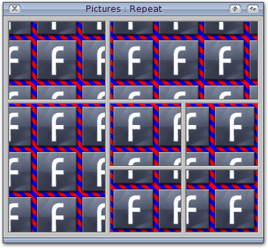
Finaly, the repeat mode is defined using the following keywords: repeat, repeat-x, repeat-y, no-repeat. The initial position of the picture is used while repeating it.
<?xml version="1.0" ?>

<?xml-stylesheet href="pictures-positioning.css" type="text/css" ?>

<feelin:application>
    <Application Id="app">
        <Window Id="win" Title="Pictures : Repeat" Open="true">
            <Group Rows="2" Orientation="vertical">
                <Image class="picture-box" SetMax="none" Spec="url(button.png) center" />
                <Image class="picture-box" SetMax="none" Spec="url(button.png) left center" />
                <Image class="picture-box" SetMax="none" Spec="url(button.png) top center" />

                <Group Rows="2" Orientation="vertical">
                    <Image class="picture-box" SetMax="none" Spec="url(button.png) top left" />
                    <Image class="picture-box" SetMax="none" Spec="url(button.png) top right" />
                    <Image class="picture-box" SetMax="none" Spec="url(button.png) bottom left" />
                    <Image class="picture-box" SetMax="none" Spec="url(button.png) bottom right" />
            </Group>
        </Window>
    </Application>

    <notify>
        <win attribute="CloseRequest" value="true" target="app" method="Shutdown" />
    </notify>
</feelin:application>
Pictures are managed through the Picture class.
Callback hook
Finally, a callback hook can also be used to draw the image using the pointer notation '0x' followed by the hexadecimal representation of the struct Hook. The hook is called with a pointer to itself, a pointer to the object, and a pointer to a FS_ImageDisplay_HookDraw message.
The RastPort and coordinates validity are checked and the rectangle is clipped (if possible) before the hook is called.
Height -- (01.00) [..G], uint32
Return the image height.
Currently, only pictures have dimensions, the others have a default size of 10 pixels.
Width -- (01.00) [..G], uint32
Return the image width.
Currently, only pictures have dimensions, the others have a default size of 10 pixels.
Mask -- (04.00) [..G], bool32
Use this attribute to know if you need to erase the region before you draw the image (images without ask erasing everything).
Setup -- (01.00)
IFEELIN F_Do(Obj, FM_ImageDisplay_Setup, FRender *Render);
Function
Since your object doesn't know anything about display environnement after it is created with the New method, you must send this method to setup your object. Colors will be allocated, pictures and brushes remaped...
The Render object supplied with the method must stay valid until the next Cleanup method. A pointer to this object is kept to allow on-the-fly image changes.
Cleanup -- (01.00)
IFEELIN F_Do(Obj, FM_ImageDisplay_Cleanup);
Function
Cleans up resources associated to object. If the Setup method was previously invoke, this method must be invoked before the object is disposed.
Draw -- (01.00)
IFEELIN F_DoA(Obj,FM_ImageDisplay_Draw,FS_ImageDisplay_Draw)
Function
Use this function to draw the image.
Inputs
Render (FRender *)
Because images can be shared, an appropriate FRender must be supplied to correctly draw the image.
Rect (FRect *)
Describes the area in which the image should be drawn.
Flags
FF_ImageDisplay_Region
If this flag is set the FRect is used as a struct Region (which may hold multiple rectangles). This region is a standard graphics.library region, created with the NewRegion() function and composed with functions such as OrRectRegion().
By using the regions facilities you can fill multiple areas in a single step and also create rather complex rendering and refreshing. Such facilities are used by the Group class when clearing damaged zones in complex rendering mode.